
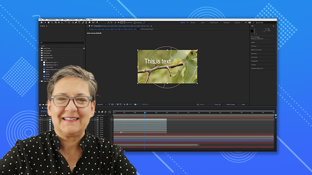
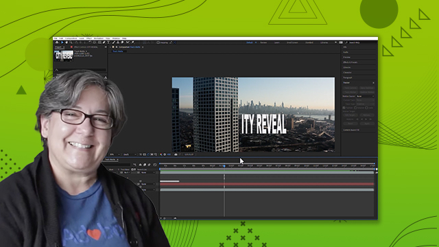
Character
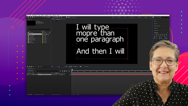
Adjust character settings such as font, size, style and kerning.
This summary is AI generated
Learning Outcomes:
- Adjust character settings in After Effects
- Modify font size, style, and color
- Understand kerning and tracking for readability
Level: Intermediate
Skills you'll gain:
After Effects, Typography, Text Editing, Design
Key Insights
- Use the character and paragraph panels for text adjustments.
- Select text to apply changes in After Effects.
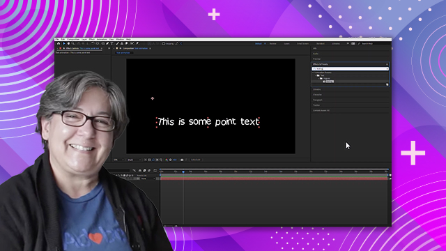
- Scrub numbers for dynamic font size adjustments.
- Kerning affects the space between two characters.
- Tracking adjusts the space between all characters.
- Typography enhances text readability, not just aesthetics.
- Use leading to control line spacing effectively.
- Apply strokes and colors to enhance text visibility.
- Understand the importance of font selection for design.


 AdChoice